
flexboxの素晴らしいポイント
- flexboxは、CSS3の新しいモジュール。エレメントを並べる時に、非常に簡単にでき、方向を変えたりするのも楽。
- flexboxが発明された主な理由は、コンテナを作ることによって、エレメントを大きくしたり小さくして空間にフィットしやすくするように作られた。
- レイアウトがより簡単になり、論理的なコードになる。
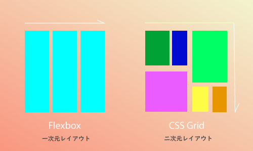
- flexboxは一次元的なレイアウトの方法で、対するCSS Gridは二次元的なレイアウトが得意。(図解)
flexboxの主なコンセプト
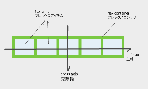
シンプルなflexbox。
大きな枠は、flex containerと呼ばれる。そのflex containerの中に入っているのが、flex itemsと呼ばれる。
基本的な性質は、flex containerは左が起点になって、右に順番に並ぶ。
これをmain axis(主軸)、逆方向をcross axis(交差軸)と呼ぶ。
flexboxプロパティ概要
| container | item | ||
|---|---|---|---|
| flex-direction | row, row-reverse, column, column-reverse | align-self | auto, strech, flex-start, flex-end, center, baseline |
| flex-wrap | nowrap, wrap, wrap-reverse | order | 0~ |
| justify-content | flex-start, flex-end, center, space-between, space, around, space-evenly | flex-grow | 0~ |
| align-items | stretch, flex-start, flex-end, center, baseline | flex-shrink | 1~ |
| align-content | stretch, flex-start, flex-end, center, space-between, space-around | flex-bases | auto, length |
display: flex;
See the Pen
CSS course01 by aiworldexplore (@aiworldexplore)
on CodePen.
display: flex; とすると、数字で示したチャイルドエレメントが、左から右に、順に1~5まで整列する。
flex-direction: row
これが、初期値になっていて、入力しなくてもrowになっている。
flex-direction: row-reverse
See the Pen
CSS course02 by aiworldexplore (@aiworldexplore)
on CodePen.
reverse=逆転
言葉の通り、1~5の並びが逆転する。
flex-direction: column;
See the Pen
CSS flex-direction: column; by aiworldexplore (@aiworldexplore)
on CodePen.
今度は、columnを使ってみる。
これは、上から下にアイテムが並ぶ。
flex-direction: column-reverse;
See the Pen
CSS flex-direction: column-reverse; by aiworldexplore (@aiworldexplore)
on CodePen.
縦方向になり、下から上へと順序が逆転する。
justify-content: / コンテナの場所を決める
jutify-content: center; / 真ん中へ
See the Pen
CSS justify-content by aiworldexplore (@aiworldexplore)
on CodePen.
justify-content: center; =コンテナ自体を真ん中へ移動。全てのアイテムが真ん中に整列される。
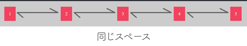
justufy-content: space-between; / 同じサイズの空間をアイテム同士に与える事ができる
See the Pen
CSS justify-content: space-between by aiworldexplore (@aiworldexplore)
on CodePen.
justufy-content: space-around; / スペースをアイテムの周りに与える
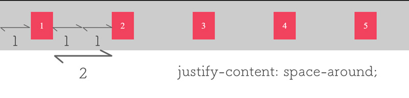
先ほどのspace-betweenに似ているが、少し違っていて、同じだけのスペースを各アイテムに与えることができる。
See the Pen
CSS justify-content: space-around; by aiworldexplore (@aiworldexplore)
on CodePen.
justufy-content: space-evenly; / 同じサイズのスペース
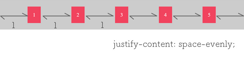
全て均等にスペースが与えられる。
See the Pen
CSS justify-content: space-evenly; by aiworldexplore (@aiworldexplore)
on CodePen.
justify-content: flex-end; / 右に寄せる
See the Pen
CSS justify-content: flex-end; by aiworldexplore (@aiworldexplore)
on CodePen.
justify-content: flex-start; / 左に寄せる
See the Pen
CSS justify-content: flex-start; by aiworldexplore (@aiworldexplore)
on CodePen.
コメント 作品をシェア!